How Having My Colours Done Has Lessened The Shopping 'Noise'
The art of an 'edit within an edit'...
So you’ve seen the TikTok filters, and you know that Zooey Deschanel is a winter - but why is everyone getting their colours ‘done’ and what does it mean?! Well, I volunteered myself as a tribute here because I’ve gone and done exactly that and the results are well… interesting.
It boils down to this - having your colours ‘done’ or analysed is using various tools to find out what colours work best with you. ‘Best’ meaning:
Colours that make you glow.
Colours that compliment your hair and eye colours.
Colours that generally make you look healthy and bring light to your face, even when there’s not a scrap of makeup on your skin.
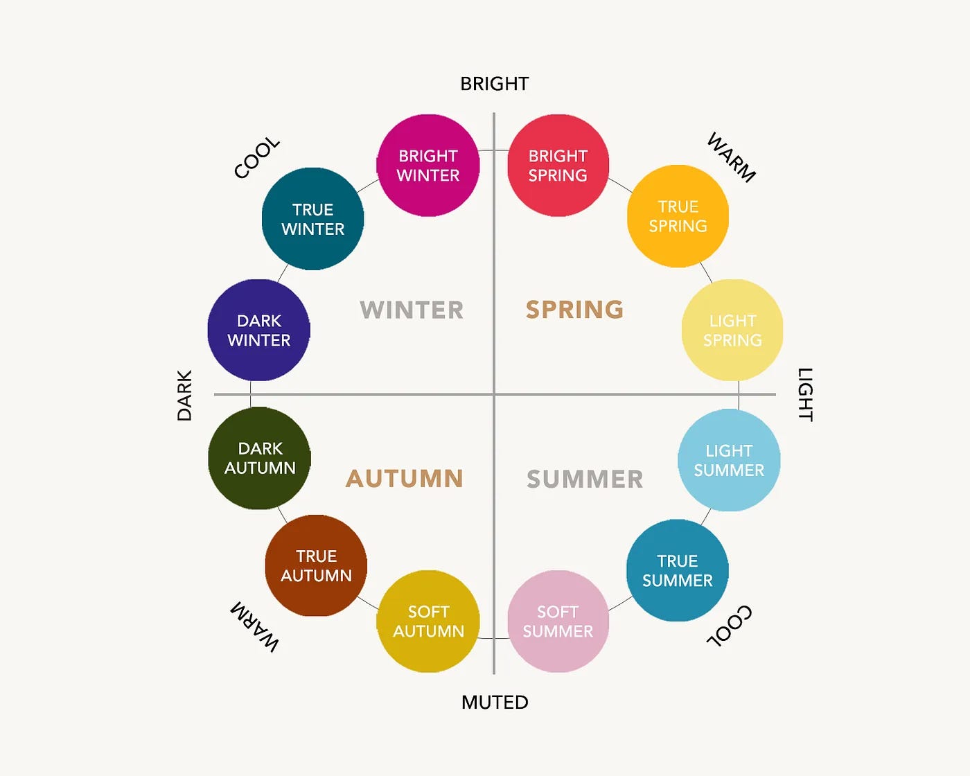
Colours are split into seasons, then each season into three categories. So for example you can be a dark autumn, a true autumn (also known as a warm autumn), or a soft autumn (also known as a light autumn). Winter and summer have cooler palettes with more blue tones in their colours, and spring and autumn have warmer palettes with more yellow tones in their colours. Are you still with me!?
There are two reasons I wanted to do it:
As a general avoider of colour, I wanted to find out what colours make me feel like a million dollars. So if I did ever venture away from my beloved black I could do so with confidence.
I wanted to discover my ‘perfect’ neutral palettes. Were there untapped neutrals that could lift and brighten that I’d yet to play with? (SPOILER: yes).
…and there’s the third reason - I really love this s**t. There is so much chatter these days around the journey of personal style, and in my eyes, colour analysis works similarly to a styling session with a professional, or nailing down your three words. It can be a guide to assist you; another editing tool in your own styling kit. A guiding light if you will. That’s always there and can be ignored if it’s not serving you, but can light up a path in a certain direction if you need a hand. Just like other personal style tools, it’s something to be picked at on the wardrobe buffet (à la Heather), not a set of hard and fast rules. Because we all know by now that there simply are no styling ‘rules’.
THE PROCESS
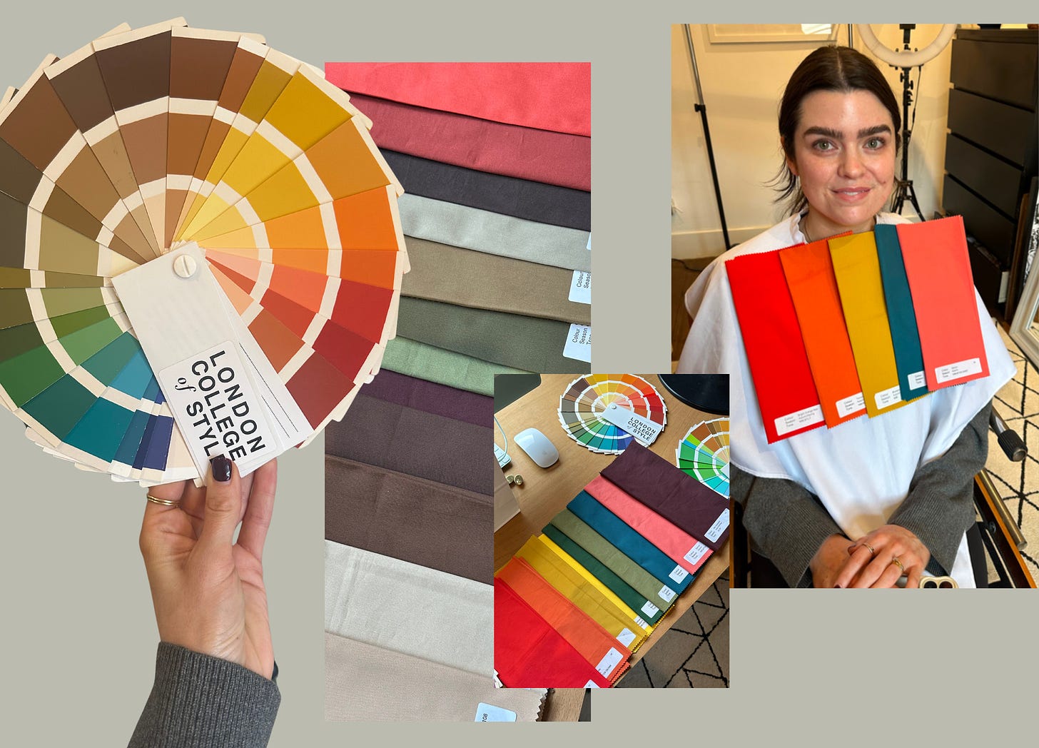
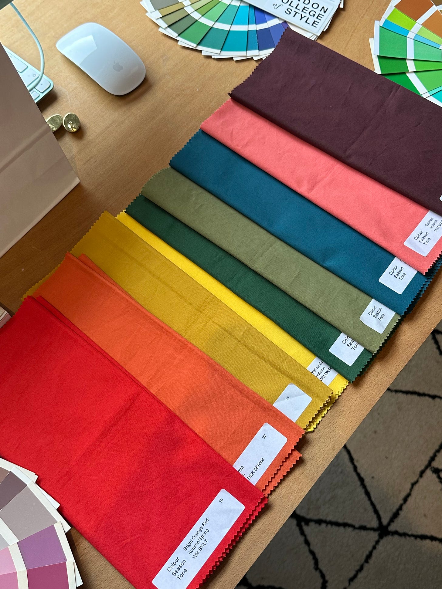
Colour analysis can be completed in-person or online, although in-person is preferred as online can’t always catch the exact tones and nuances in our skin tones and colourings. I mean have you ever really been able to see a difference using those TikTok filters?! Nope, me neither. I went to a local lady, Jo and I would 10/10 recommend. We spent 90 minutes trying on every colour of the rainbow and making notes on the colours that made me shine and the ones that made me look ill and grey around the gills. Me in a pastel was akin to me with food poisoning.
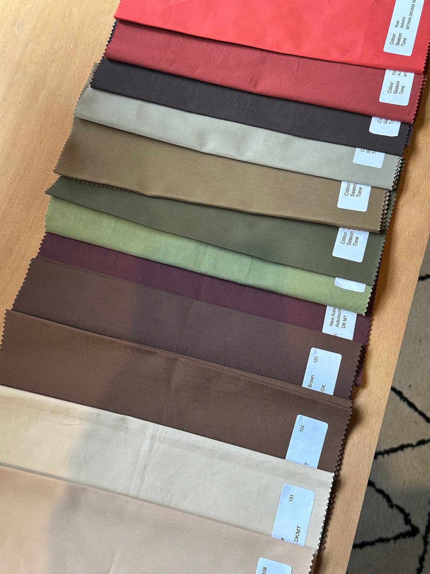
The best part was the draping. Jo focused on one colour and then layered up different tones like I was a big baby wearing a bib. She then peeled them back one by one, like an onion, and we discussed our thoughts layer by layer. One interesting thing was just how quickly ‘my’ colour palette took shape and how easy it was to see the common threads between them. The colours we put to the side in the ‘yes’ pile were rich and often muted versions of a colour; a salmon pink, a deep orange, an intense aubergine purple.
We then repeated the same ‘onion peeling’ process with a more neutral palette…
THE FINDINGS
Jo’s analysis was that I am a ‘TRUE AUTUMN’ with a warm undertone, soft features and low contrast. My best colours are rich, warm and muted.
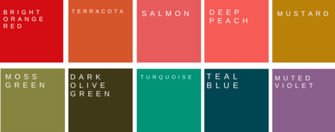
The good news? Gold jewellery is preferred for true autumns, which I was pleased to hear *shoots a look at overflowing case of exclusively gold jewellery*. The not so good news? Black isn’t one of my best colours. To be honest it’s no surprise. I will regularly change out of a black jumper before I start filming and into something in a brighter beige shade because it doesn’t wash me out on camera. Here are some tips if you feel like black is something that you LOVE but you feel makes you look a bit ‘bleurgh’:
Wear black on the bottom half, not the top.
Try not wearing it so close to the face so opt for v-necks or vests.
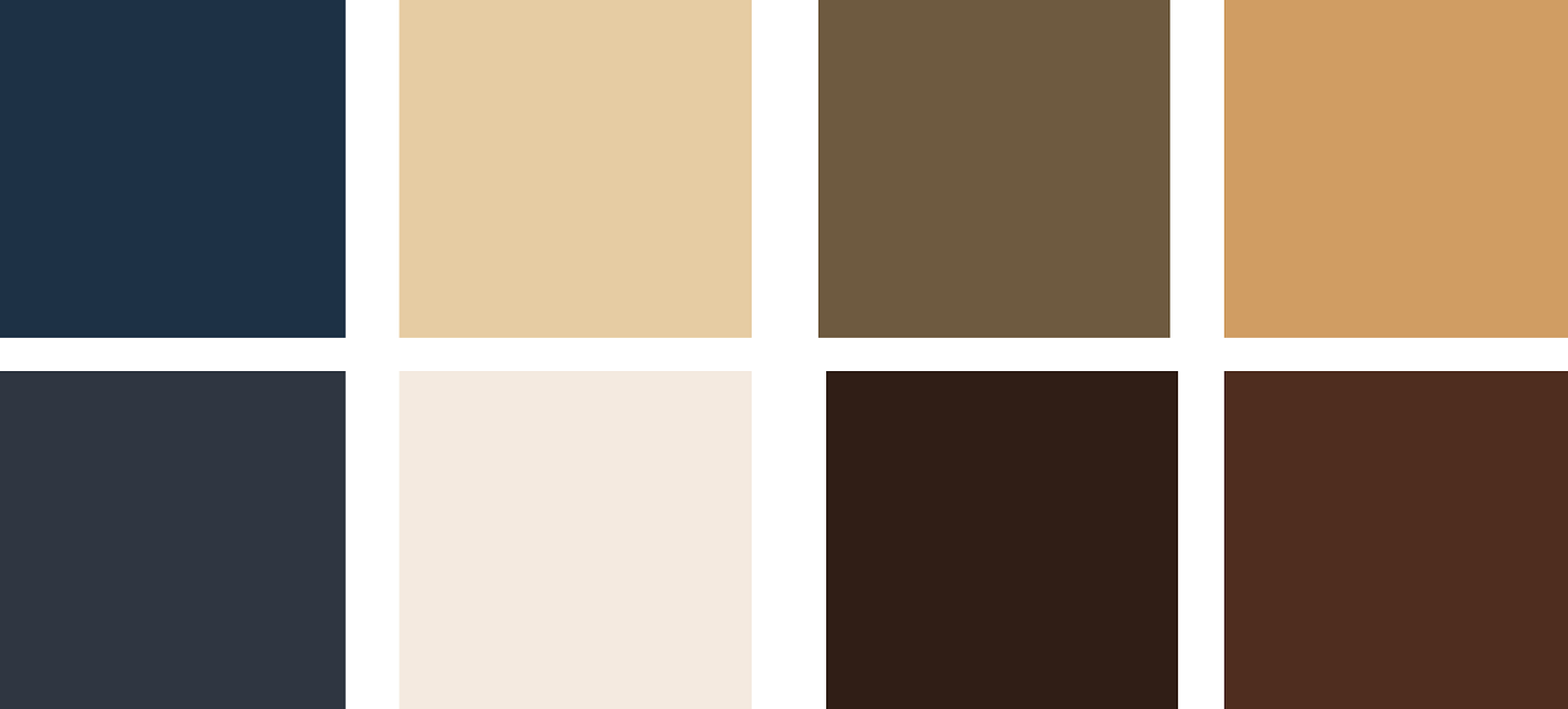
Give other deep neutrals a go, like charcoal, navy and deep coffee tones.
It might not be my top option of things to wear on no-makeup days.
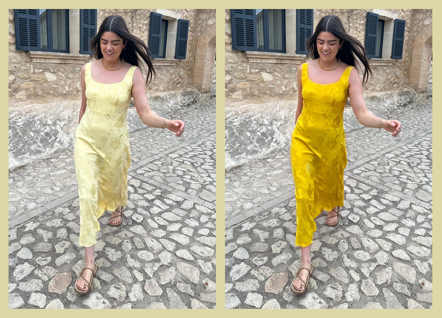
Jo said that’s the funny thing about these colour analysis appointments is that most of the time, clients have already gravitated towards colours they look the best in. She’s just there to validate what we already know. It’s just part of our natural preferences. For example I haven’t worn pastels since I attended a Steps concert at the Brighton Centre in 1999 (factchecked! That setlist was WILD).
HOW IT’S CHANGED MY SHOPPING HABITS ALREADY
One thing I wasn’t expecting was that having this knowledge creates an ‘edit within an edit’ in your brain. This weekend I had a browse around Liberty and not only was my brain shifting out the pieces that I gravitate towards - denim, suede jackets, wool coats - from those that I don’t - floaty dresses, patterned tops and skirts. But it was automatically doing a secondary edit, filtering out the rich, deep, muted colours (and trying to avoid black), from any pastels or bolder shades. The noise had lessened and the refinement taken up a notch. I left empty-handed which is probably more to do with my ‘one-purchase-a-month’ rule I have in place, but nothing felt like it satisfied my new additional criteria.
Now look, one thing to know about me is that I’m an absolute textbook Teacher’s Pet™️. It’s very ‘me’ to be given a new set of guidelines and attempt to execute them perfectly. I aim to please (and yes I’m working on it!). So of course I’m going to absorb the findings into every fibre of my being. That’s just me! Not everyone is going to be this way, or be thrilled with their seasonal prescription, but ultimately it’s just information that’s there to pick and choose and apply to your style as you so wish. But I’ve found it pretty enlightening.
I feel like it’s going to help me be even more confident in my future purchases. And help me to expand my neutral palette - I’m thinking more olives, khakis, rusts and less black. Like could I go the whole year and NOT add anything black to my wardrobe?! That would be something!! I’m more tuned into warmer tones. Even down to the type of leopard print that I love. I know that when I eventually make that big once-in-a-lifetime leopard print coat purchase I’d like it to be deep and rich and not with a cool, grey shift to it. I think it will help with those big occasion moments too. You know when you’re a guest at a wedding and you just want to feel FAB. I now have an index of bolder colours to select from, which makes the faffy process of formal dress shopping even more streamlined.
I wonder what ‘80’s trend we’re going to dredge up next!? Tupperware parties? You know what? I would actually LOVE to go to one of those. That’s my idea of good evening right there!! And I am not joking. BRING ‘EM BACK! Overall this session is certaintly not a ‘need’, but it feels like supplementary reading. Additional style knowledge that I will put to good use. Plus, most of the time you’re supporting a local businesswoman!! Go for it. Enjoyed this read? Subscribe! I’m always chatting away about personal style on here.
Until next time!
Anna x



Oh Anna I am so pleased you went to a real consultant rather than use TikTok filters: I think it is such a useful thing to do. Like as a fellow (dark) autumn I now avoid black as it drains me. And I am also gravitating towards khakis and other colours too.
Hi, Anna. I had my colors done the first time around, in about 1984. I'm a "Summer". Every one of the colors that "does not look fab" on you LOOKS FAB on me. I have one of the most functional and expressive wardrobes of anyone I know, and I only buy things now when the old ones wear out. That usually only happens with pants/trousers/jeans. I have sweaters over 30 years old that still look stunning because I bought quality in the first place. I encourage you to do the same now that you know the colors that look best on you, and those you should avoid. Good luck and good style, Autumn.